ux/ui design


Mar 2020 - Nov 2021
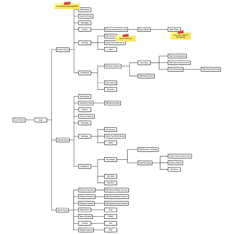
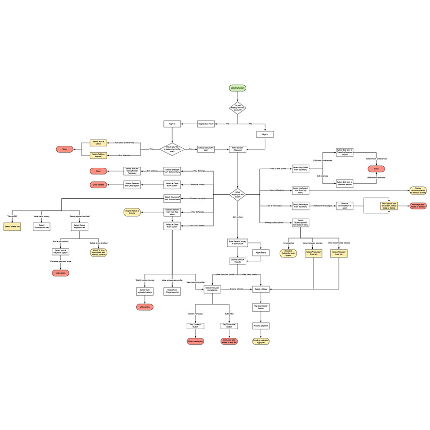
DeepMove
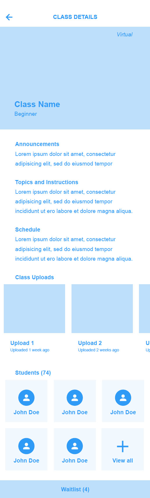
DeepMove app offers online and in-person fitness classes created by instructors for students while cultivating a sense of community within the space.
Tasks:
- User Research
- Sitemap
- User Flows
- Wireframes
- Visual Design
- Consult Dev Team
- Create Assets
Tools:
- Balsamiq
- LucidChart
- Adobe XD
- Adobe Illustrator
Objectives
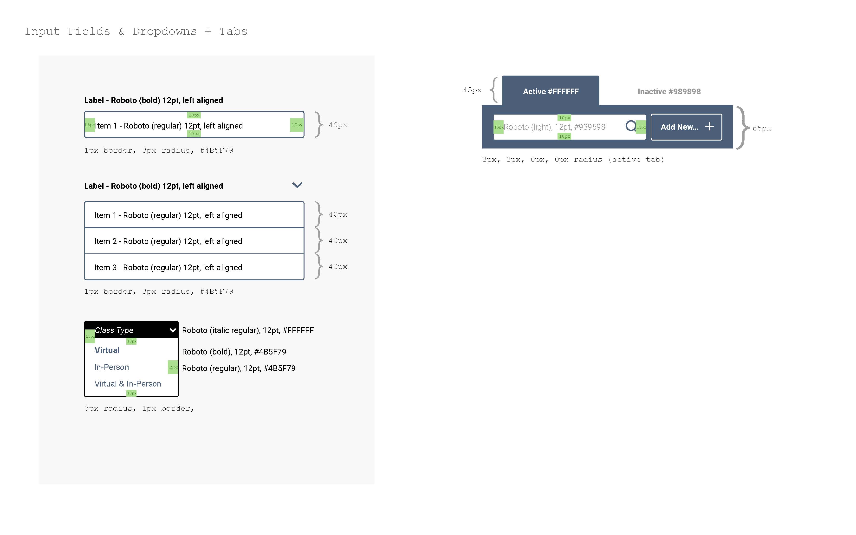
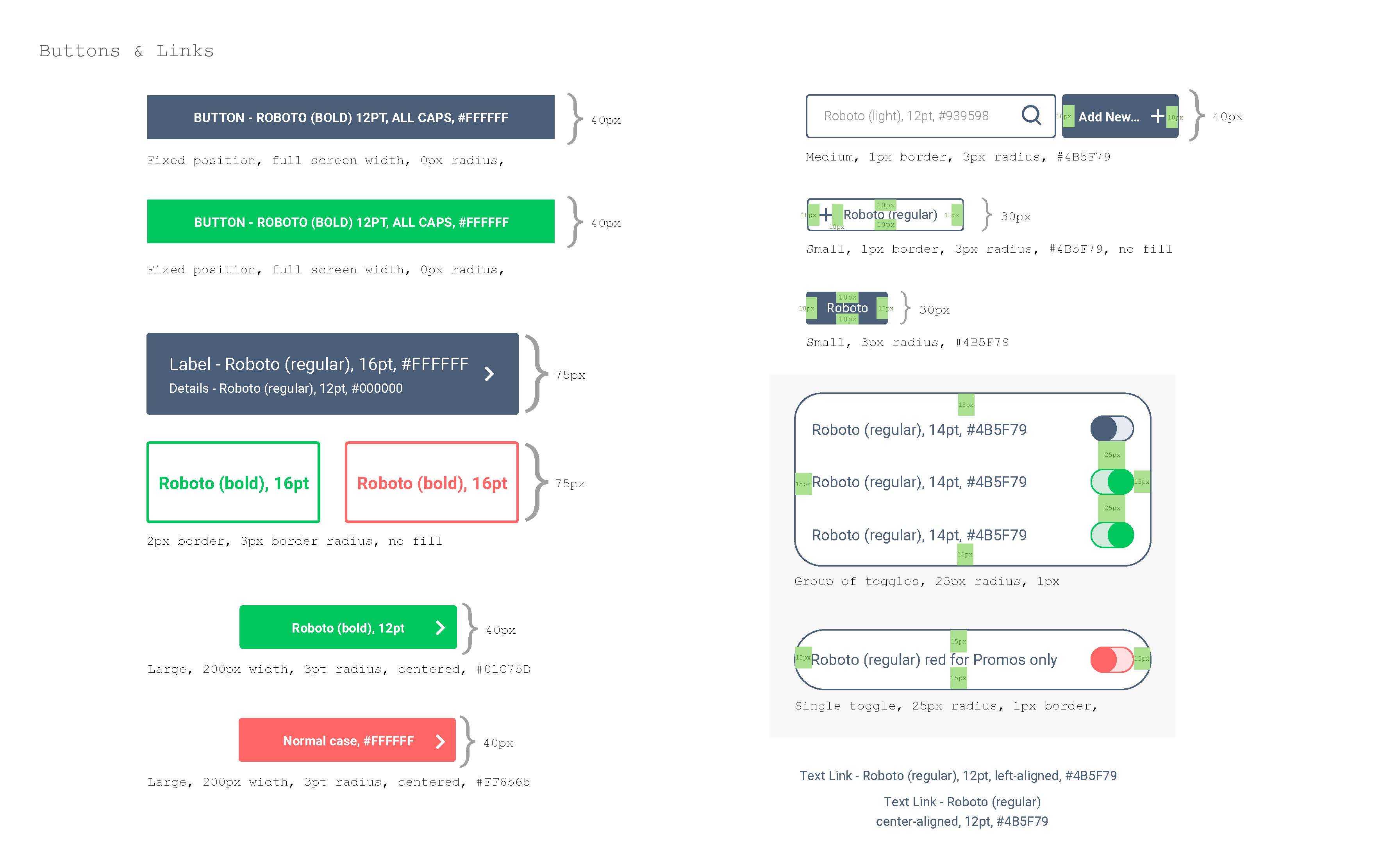
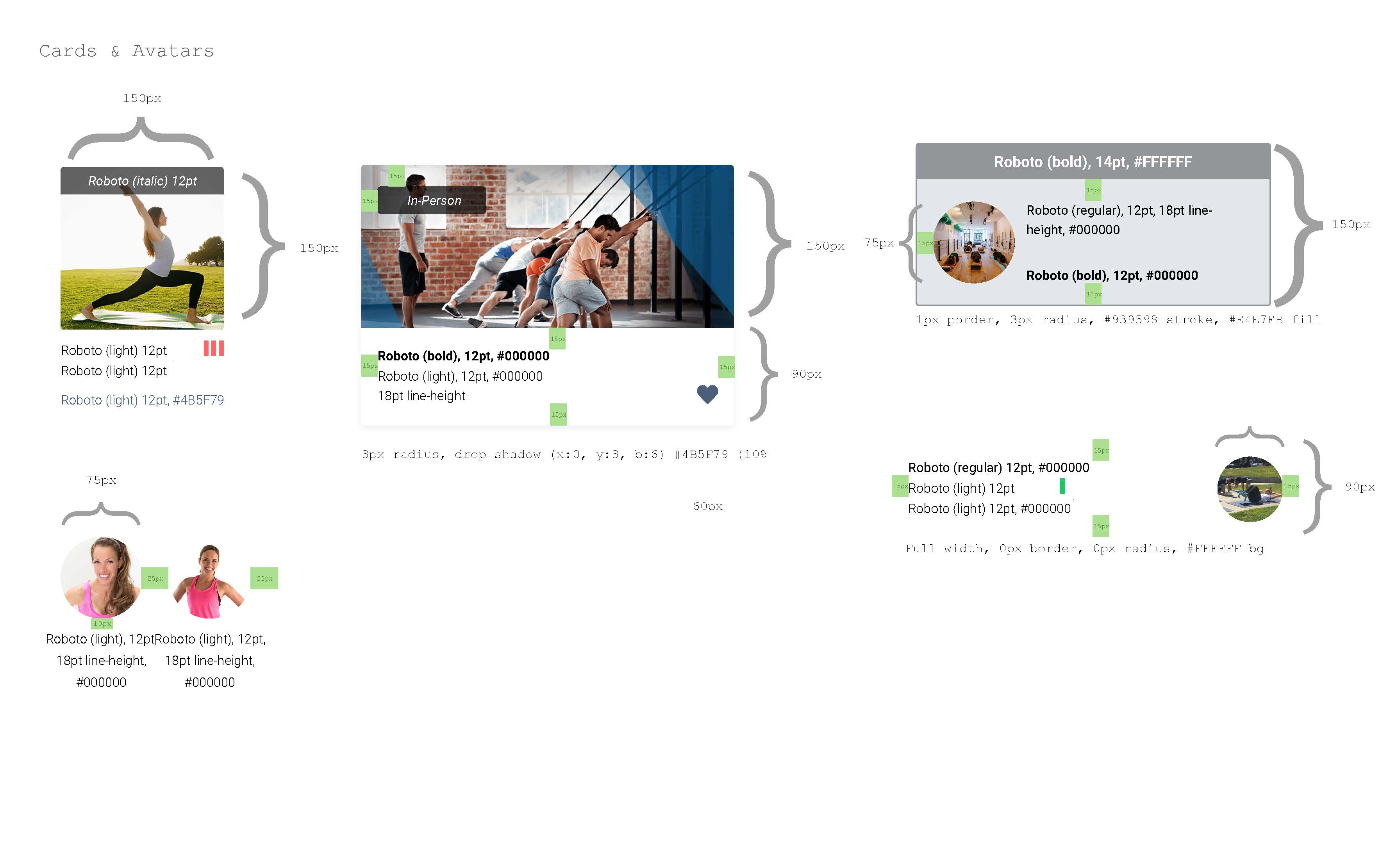
Map out and establish user flows for each stakeholder: the Students, Instructors/Studios and Admin/Client. Additionally, a clean UI with a minimalist aesthetic supporting all three flows was to be designed.
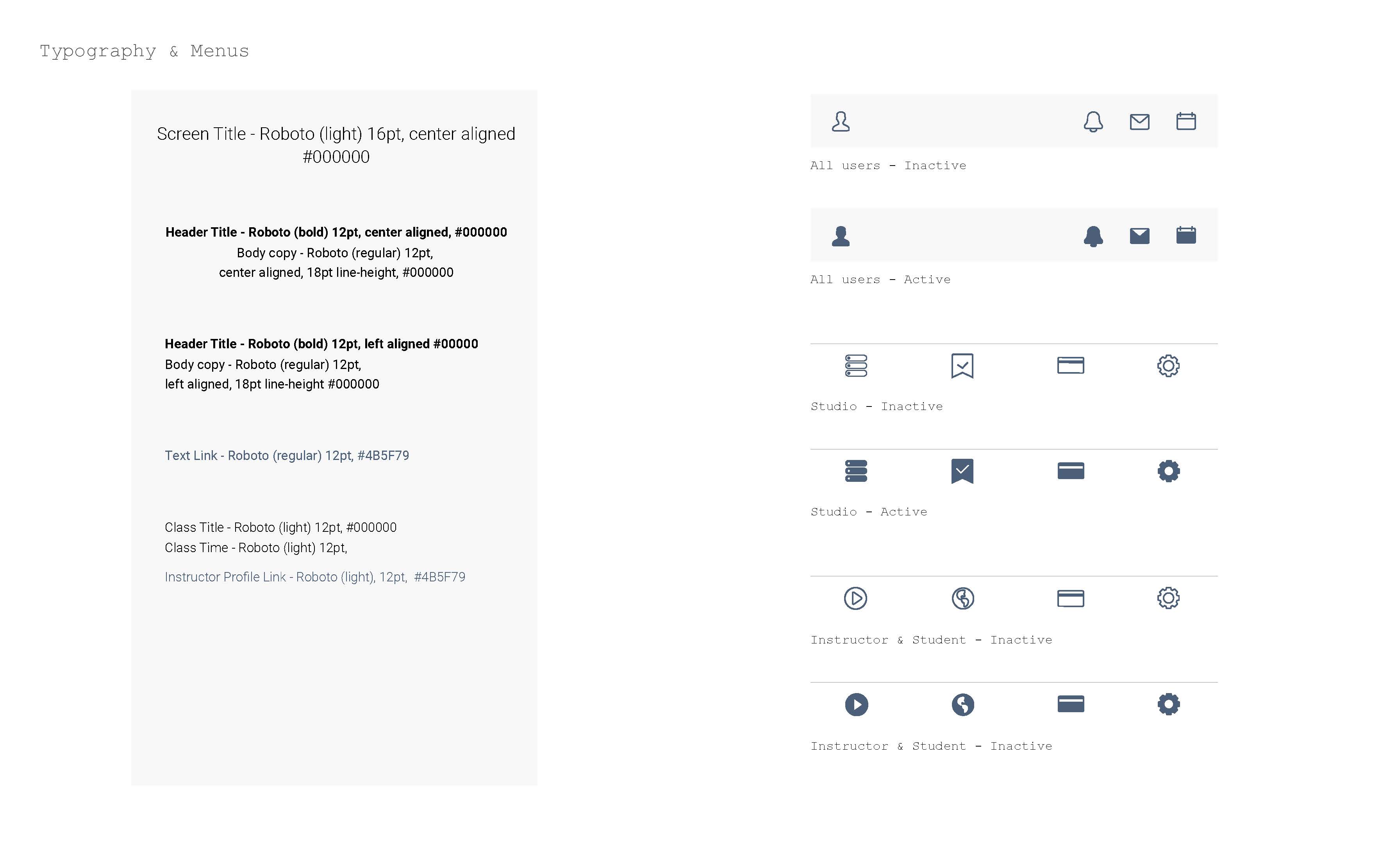
In order to ensure consistent UI elements throughout development, I put together a design guide for the dev team. Values such as spacing, font sizes, dimensions, border radius and hex color codes were indicated.
Jan 2022 - July 2022
FlexSite
FlexSite is a property rental platform where commercial spaces can be listed by hosts and booked out by guests.
Tasks:
- User Research
- Wireframes
- Visual Design
- Consult Dev Team
Tools:
- Moqups
Objectives
Improve the website design as well as dashboard user experience and interface based on what has been partially developed by a previous team.
May 2021 - July 2022
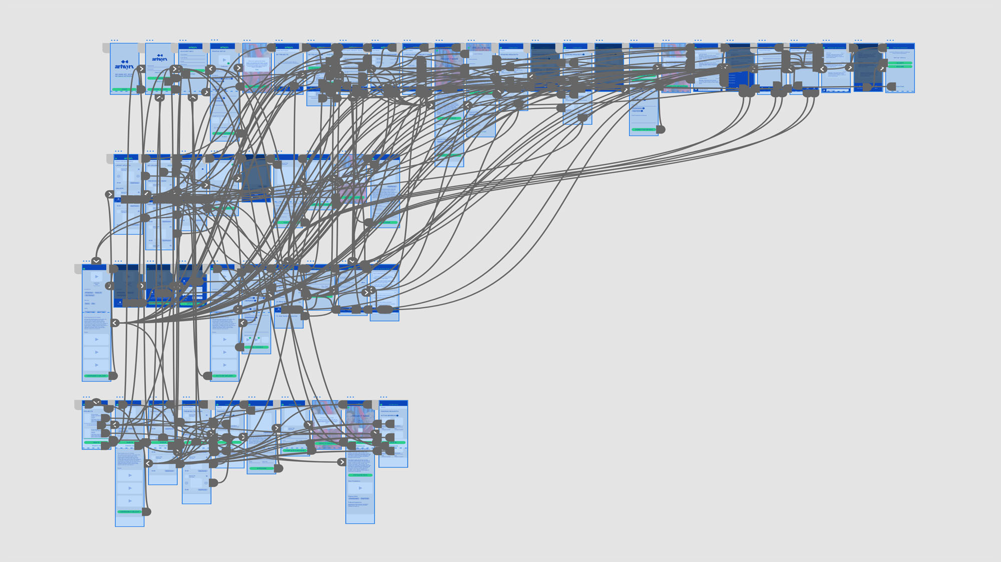
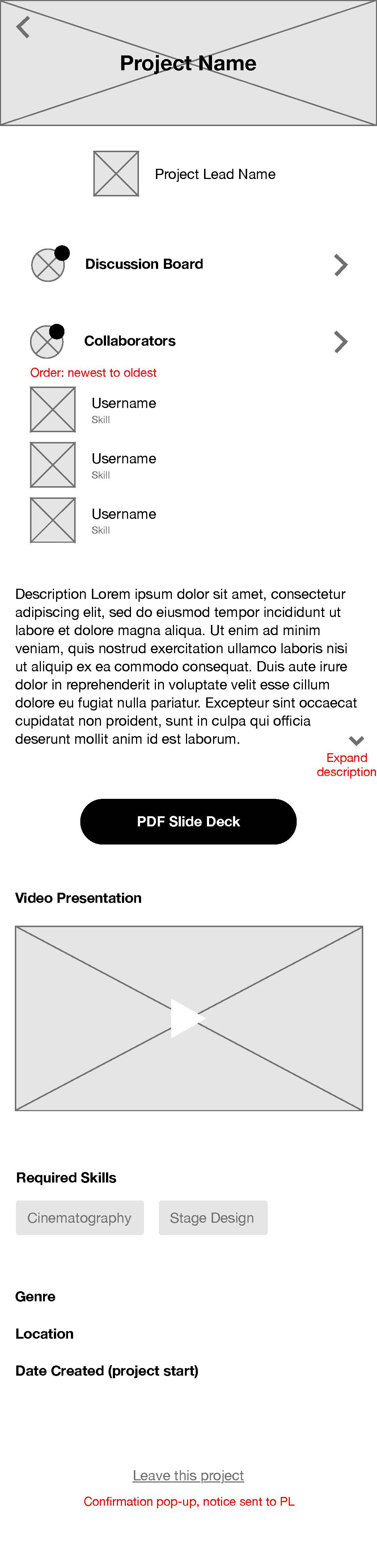
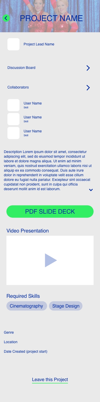
Artwyrx
Artwyrx is a mobile app for creatives in the cinematography industry. It is part project management tool and part marketplace, for both gigs and artwork.
Tasks:
- Sitemap
- User Flows
- Wireframes
- Visual Design
- Prototype
Tools:
- Balsamiq
- LucidChart
- Adobe XD
Objectives
Create a space for those involved in various aspects of filmmaking where project managers can create gigs/job posts and collaborators can apply. Another aspect of the app is a gallery where members can upload digital or physical artwork and other members or guests can purchase them.
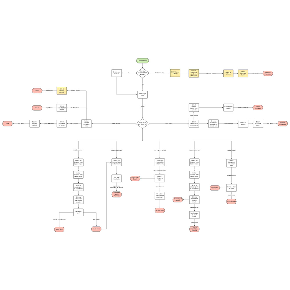
A clickable prototype was implemented to the screen designs so that the client can get a fuller experience and understanding of navigating through the app.
etc. projects


Video
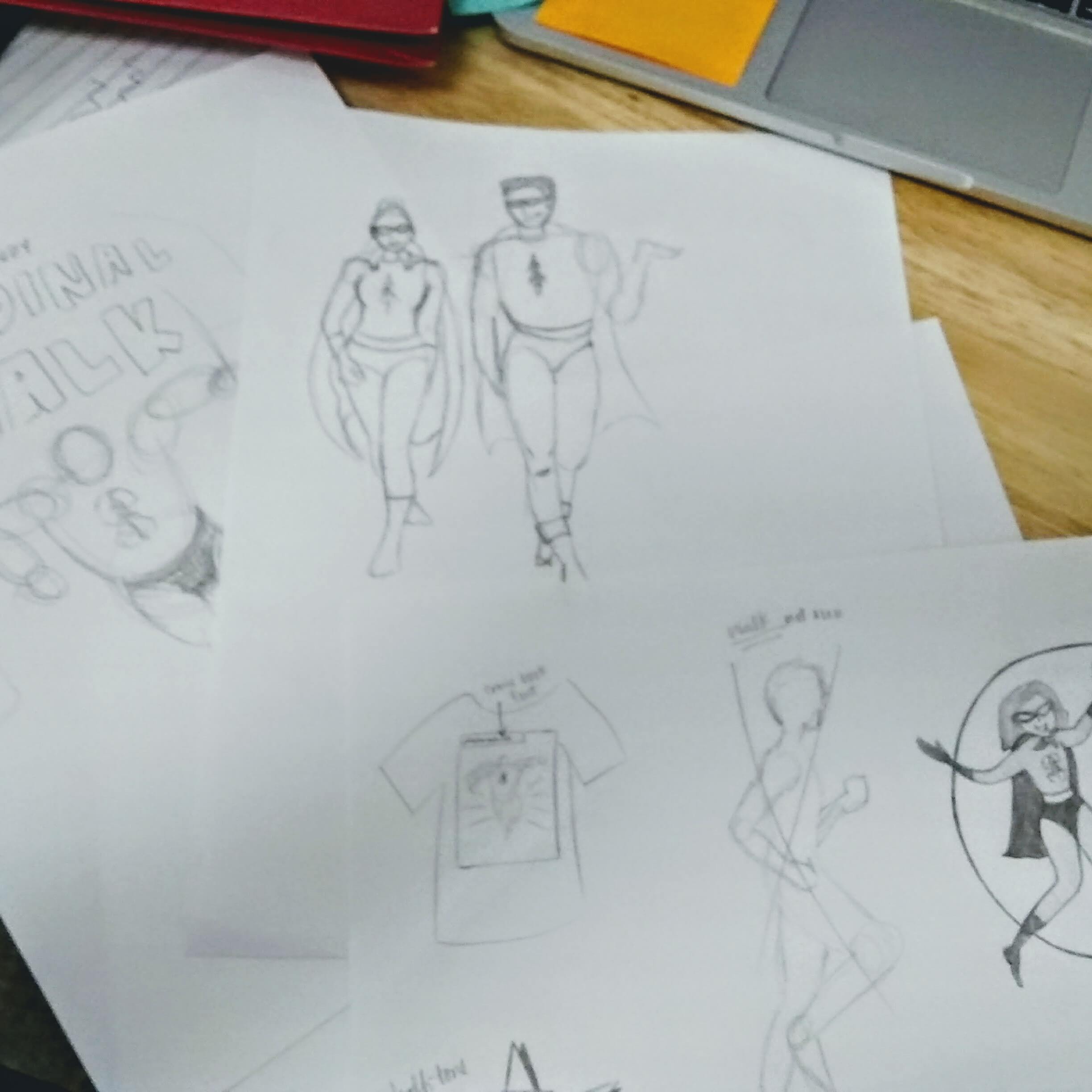
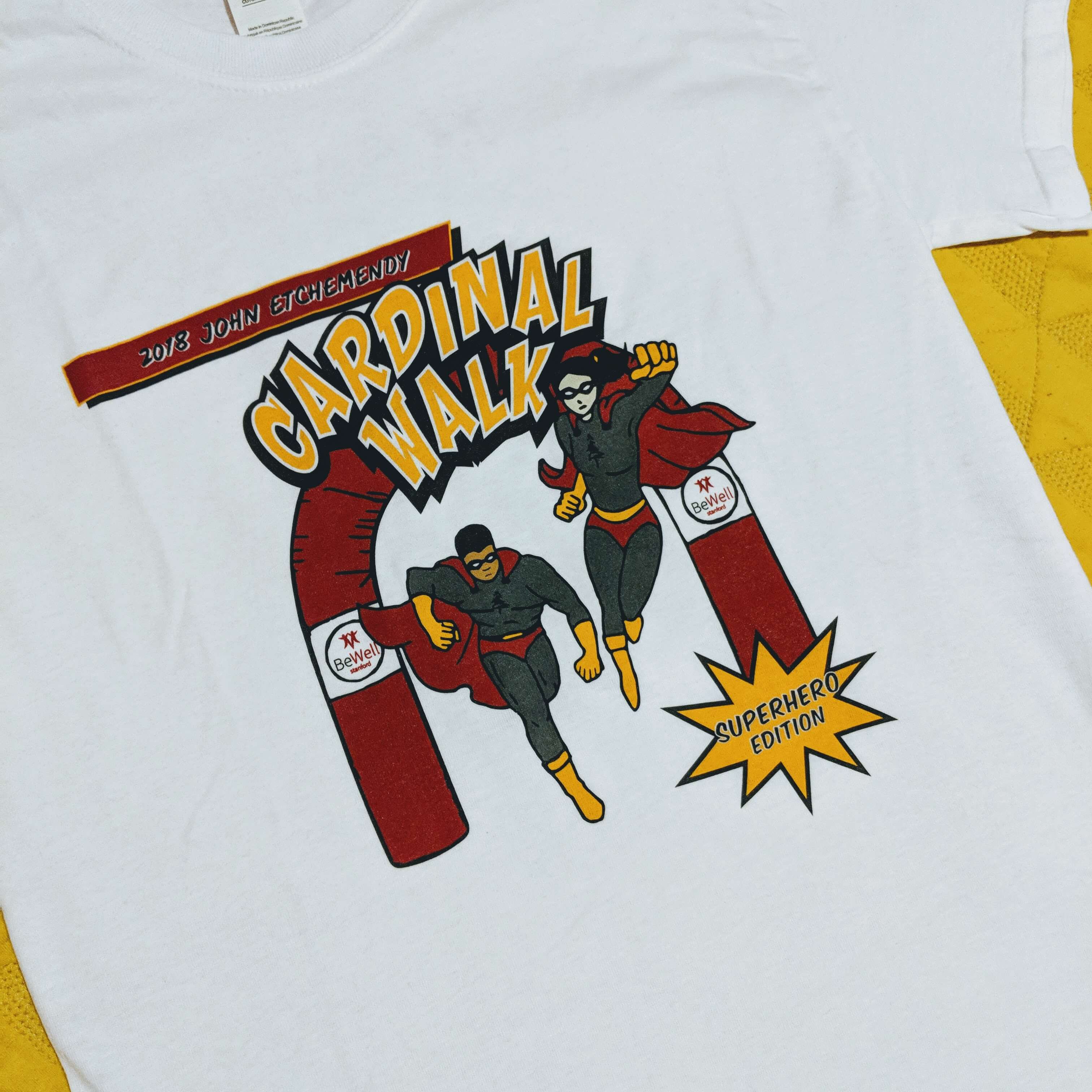
Cardinal Walk 2018
Captured the 2018 Annual John Etchemendy Cardinal Walk as part of Stanford's BeWell program. The main goal was to highlight the event and put together a short video that may be shared on the web and social media. To further support the event, I also designed the collectible t-shirt for this year:
Music by Wavves
S10 ProClean
Made a short video to accompany the Shopify website I redesigned for S10 ProClean. It advertises their camera lens cleaner demonstrating its portability and ease of use. They wanted it to appeal to a younger audience such as college students majoring in film. “Playful” and “fun” are a couple descriptions the crew associates with their product, so I went with an adventurous direction taking place in the northern coast of California; starring a mid to late 20s photographer.
Music Clips
A music video composed of clips I recorded from outdoor jam sessions by a group of friends.
Music by Dr. Dog
Digital Art
Pacific Motorcycle Training Logo
Two variations of a logo I designed for Pacific Motorcycle Training. While researching other motorcycle program logos, I found that imageries of a sportbike were a common identifier. Not only did the logo have to easily and visibly communicate motorcycle school, but it also needed to stand out from the rest of the competition. In order to achieve this, I made use of the school's name and integrated the sportbike graphic within it.
The client preferred the colors grey and orange in addition to having an overall modern look, so I went with a slate grey that was dark enough to be legible and contrast with a bright orange, helping it pop.
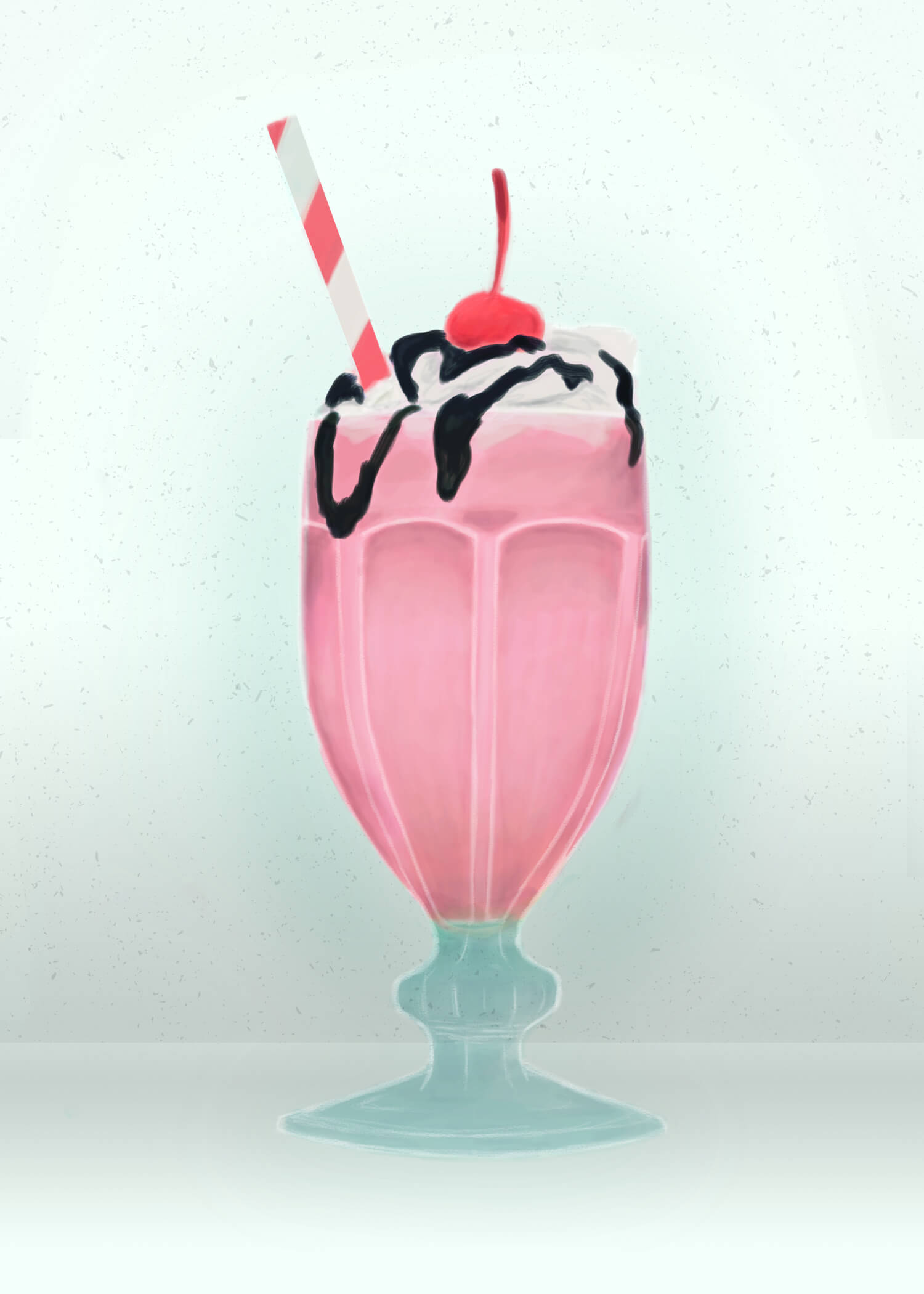
“Pinkshake”
Illustration
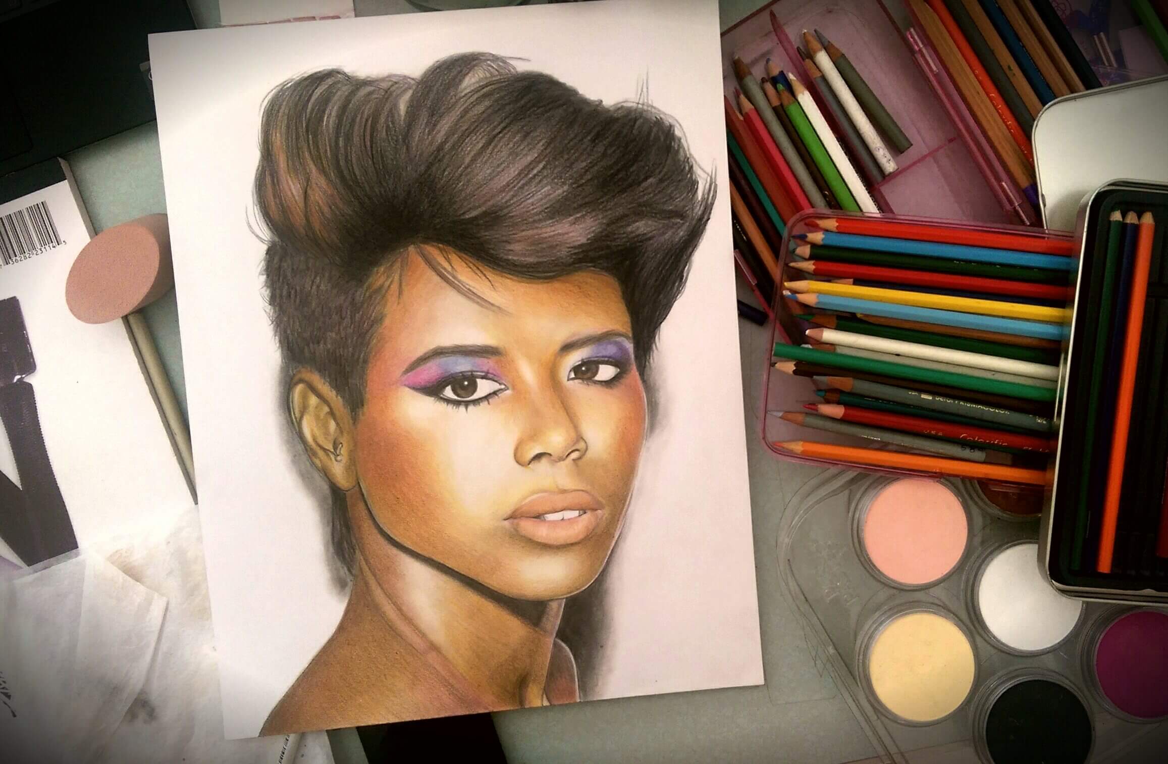
“Kelis”
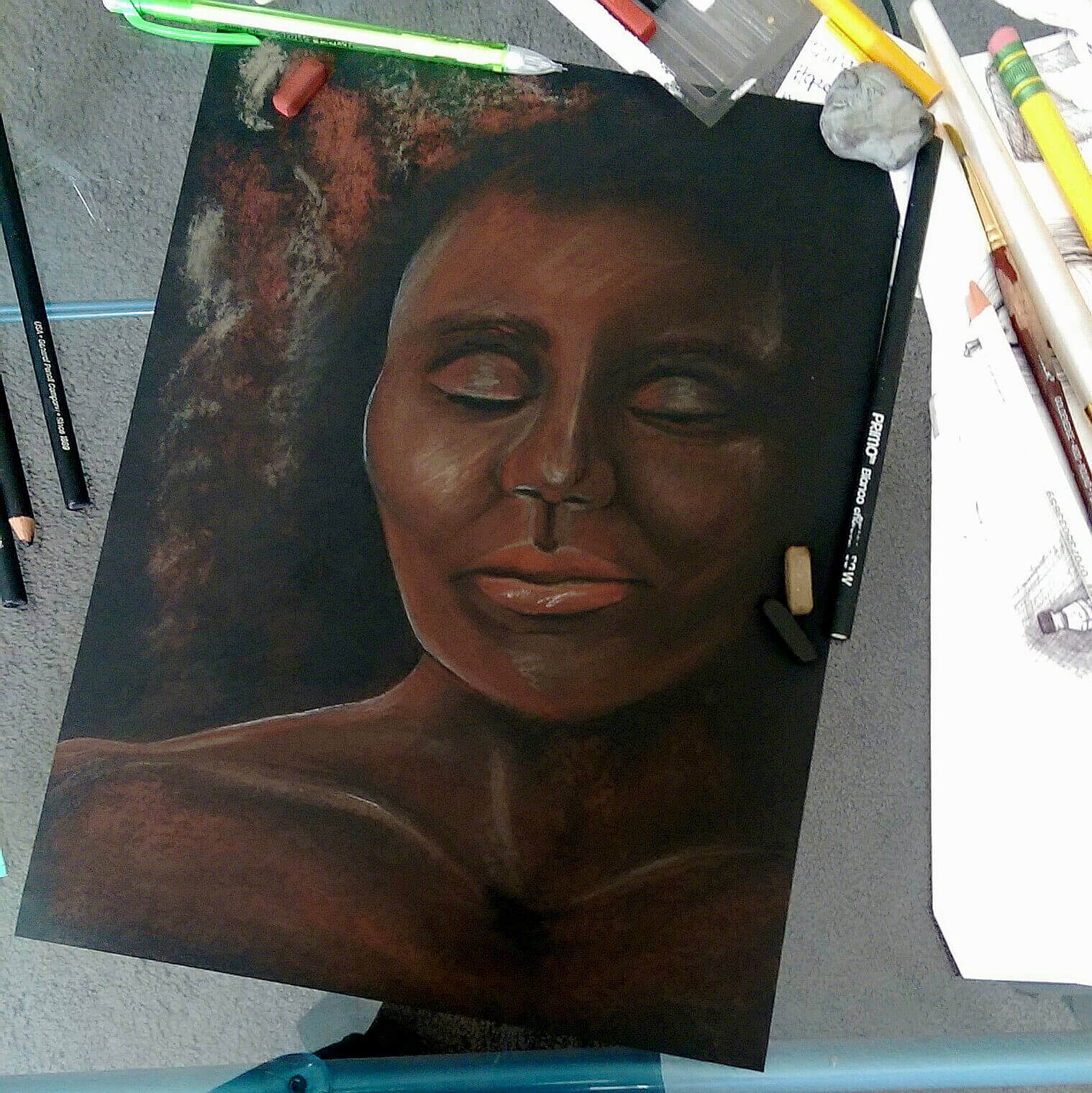
Untitled
hello, hello


My name is Nina—
I explore the multi-faceted world of design! From drawing to development, I thrive on being hands-on and learning throughout the process. I’m inspired by passionate individuals and motivated by interactive experiences. Other activities that keep me sane include watching live music, running outdoor trails, and cruising along the coast on my motorcycle.
Based in Portland and the Bay Area.
Get in touch: nina.acayan@gmail.com